 3 in 1 Linear Gauge is used to display 1 to 3 real-time data of WebAccess Tags based 3 different Linear Gauges
22.4.20 3 in 1 Linear Gauge
3 in 1 Linear Gauge is used to display 1 to 3 real-time data of WebAccess Tags based 3 different Linear Gauges
Function
Support the properties of Each Linear Gauge
Support Gauge point type:Circle, range bar, Rhombus, and rectangle
Support main range and sub range setting
Support Commander Widget (buttons / radio buttons / drop-down menu) connections to switch the trend group in Dashboard Viewer.
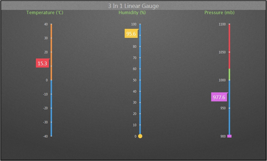
3 in 1 Linear Gauge picture
Properties:
Preferences:Build the different Properties of 3 in 1 Linear Gauge widget. Users can choose one Preferences and apply the properties directly next time usage.
Create:Create the current Properties as this widget Preferences
Update:Change the Properties of this widget Preferences
Delete:Delete this widget preferences
Set as default:User can set the widget preferences as default Widget display
Widget Setting:Set the related properties of widget, such as Widget name, Frame Color, Background, Time Interval, etc…
Widget name:Name of Widget. The title show on the top of Widget when mouse move to the top and appear blue area
Frame Color:Widget frame color
Background:Set Widget background Color.
Image:Upload and delete Widget background image
 Select the image from WebAccess widget background folder in C:\inetpub\wwwroot\broadweb\WADashboard\dResource\bkImage\daWidgetBk
 Upload the image from folder
 Cancel the background
Extended:Extend Widget background image to whole widget.
Background without title:The background extend to Title area or not
Height in Mobile Phone:Config the widget display height in Mobile. Choose full size, half size or quarter size in two phone display types, such as Small Portrait and Small Landscape. User also can self-define the display height with unit px.
Time Interval:Set data refresh time in PC/Pad and Phone mode (unit: Days/ Hours/ Minutes/ Seconds).
Title:The top area of the Widget is the Title. Type the title of Widget and Set the related Properties of title
Text:Type the title in three languages
Font Name:Set the Title font
Font Size:Set the Title font size
Font Color:Set the Title font Color
Background:Set the Title area background Color
image:Upload the Title area background image
Select the image from WebAccess Widget Title background folder in C:\inetpub\wwwroot\broadweb\WADashboard\dResource\bkImage\daWidgetTitleBk
Upload the image from folder
Cancel the background
Extended:Extend the background image to whole title area
Left Gauge:The property of a single Linear Gauge widget.
Text : The MUI display name appear on top of the current Gauge.
Size : The size of the Text in PX or EM
Font : The font of the Text
Color : The color of the Text
Style : Set different styles of point indicator of the current Gauge. Ex, Circle, Range Bar, Rhombus, and Rectangle
Color: The color of the point indicator
Span Low : The minimum range value of the Gauge
Span High : The maximum range value of the Gauge
Tick Interval : The tick scale between Span Low and Span High
Label Color : The text color of the Tick Interval
Scale Color : The scale tick color
Scale Color : The base/background color of the gauge
SubRange
Number : The number of the range will appear on the gauge
From : The span low of the range
To : The span high of the range
Color : The color of the range
Center Gauge : Same as Left Gauge
Right Gauge : same as Left Gauge
Label Setting:Enable or Disable the data Label in the widget
Date Label : Visible or Invisible Labels in the Widget
Size : The font size of the label
Tooltip:Visible or Invisible Tooltips in the Widget
Tag:Connect the Tag and the trend display and set the properties of the trend
Name of Tag group
Choose three Tags of the group
Add Group:Add trend group (maximum 12 tags for a group). User can switch trend group with control panel.
Color:Set Other text color, Button color, and button text color in control panel